
Table of Contents
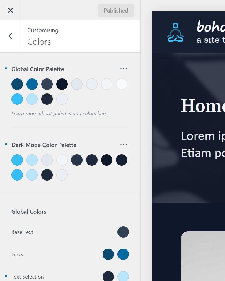
The color system’s light and dark-mode shades
Using Global Color Palettes ensures consistent styling and straightforward dark‑mode implementation. The boho color system is built on Blocksy’s default settings and extended by adding four extra ‘static’ colors.
| # | Primary use | Light | Dark |
|---|---|---|---|
| 1 | Primary brand, key accents | 900 | 400 |
| 2 | Alternative color, hover effects | 700 | 200 |
| 3 | Main text, paragraphs | 700 | 200 |
| 4 | Headings, subheadings, titles | 900 | 100 |
| 5 | Borders, dividing elements | 200 | 750 |
| 6 | Subtle background, heroes, sections, footers | 150 | 800 |
| 7 | Main background, default background color | 100 | 900 |
| 8 | Light alternative, header background | 50 | 850 |
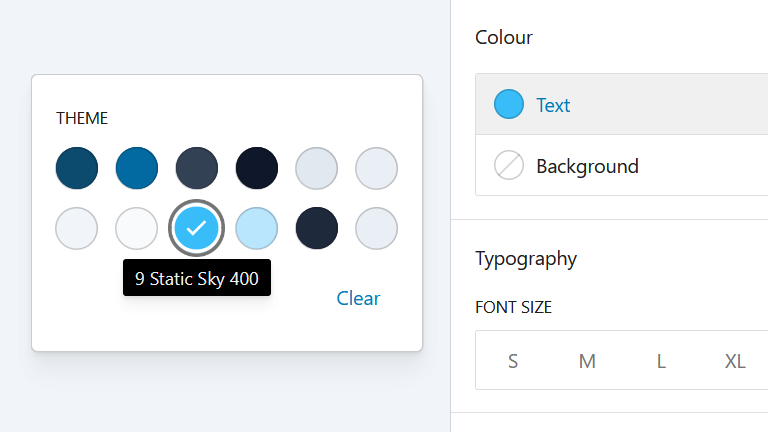
| 9 | Static Primary, brand (equal to dark #1) | 400 | 400 |
| 10 | Static Alternative, effects (equal to dark #2) | 200 | 200 |
| 11 | Static Background, flyout (equal to dark #6) | 800 | 800 |
| 12 | Static Text, (equal to light #6) | 150 | 150 |
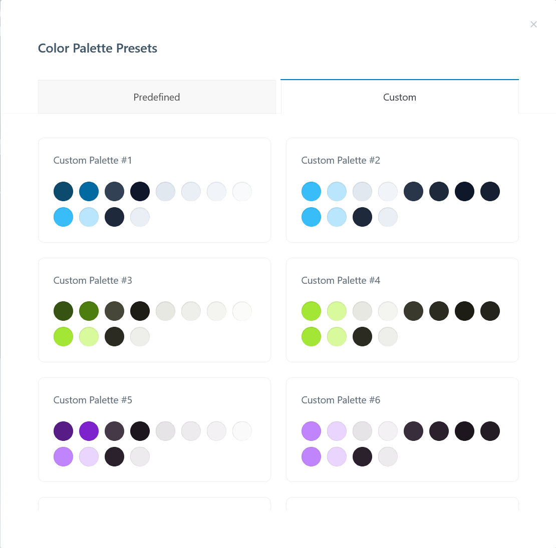
Picking the preferred palette in the customizer
The Custom Global Color Palettes are picked in the Customizer. For each of the palettes, both a light‑mode and dark‑mode version are available. These colors are then available as CSS custom properties.
Custom palette presets serve as a starting point.
Palettes are created in carefully matched light/dark pairs, combining subtly tinted grayscale hues like slate, olive, and mauve with vibrant brand colors such as sky, lime, and purple.
Consistent, accessible colors everywhere
The color palette chosen in the Customizer is available across plugins and editors, including the WordPress block editor. This helps to ensure adequate color contrast and adherence to brand colors and design system.
Color combinations demo and accessibility tests
Eight colors differs in light and dark mode
Brand and text colors primary (1), alternative (2), main (3) and heading (4) plus the border (5) can be combined with the available backgrounds: subtle (6), main (7), lighter (8). All of these differ between light and dark mode.
1 Primary | 6
2 Alternate | 6
3 Main | 6
4 Headings | 6
5 Border* | 6
1 Primary | 7
2 Alternate | 7
3 Main | 7
4 Headings | 7
5 Border* | 7
1 Primary | 8
2 Alternate | 8
3 Main | 8
4 Headings | 8
5 Border* | 8
Four static colors don’t change in light and dark mode
Paragraphs with the static colors: static primary (9), static alternative (10), static background (11) and static text (12). These colors are identical in the dark- and light-mode palettes, and can be used for menus or special sections.
9 Static | 11
10 Static | 11
11 Static | 12
12 Static | 11
Testing for adequate color contrast
Contrast checking tools are built into Firefox’s Accessibility Inspector and Chromium browser’s Lighthouse Accessibility Score. A popular online checker is WebAIM WAVE’s Web Accessibility Evaluation Tool
